About

The following product designs are of different major projects that I was a part of throughout my career, so far.

Edvoy Edge: Student & Application list

Edvoy Edge: Student & Application list

This case study explores the redesign of Edvoy Edge’s Student and Application List—two core tools used daily by counsellors to manage study abroad applicants. The goal was to simplify cluttered views, surface the right information at the right time, and align the interface more closely with how real-world counselling flows. With clear lifecycle stages, quick-access modals, and streamlined filters, the redesign makes it easier for users to track progress, upload documents, and take timely actions—ultimately helping students move smoothly from enquiry to enrolment.

Edvoy Connect: Introducer Dashboard

Edvoy Connect: Overview Dashboard

The Overview Dashboard was designed to give SRMs, team leads, and global heads a clear, real-time view of how their teams are performing. From weekly enquiries and contracts to student progress and regional trends, everything’s in one place — clean, organized, and easy to scan. With filters that adapt to each user’s role and charts that show what’s changing week over week, the dashboard helps teams stay on top of things and make faster, better decisions.

Edvoy Connect: Introducer Dashboard

Edvoy Connect: Introducer Dashboard

The Introducer Dashboard was designed to make life easier for teams managing large networks of agents and introducers. Instead of digging through complex spreadsheets or scattered tools, users get a clear, real-time view of how introducers are performing—across stages like Enquired, Verified, Customer, and beyond. With simplified charts, filters, and lifecycle tracking, the dashboard helps users quickly spot what’s working, who’s active, and where support is needed. It’s a practical, no-fuss way to keep performance in check and teams aligned.

Edvoy Edge: Academy

Edvoy Edge: Media Kit

The Overview Dashboard was designed to give SRMs, team leads, and global heads a clear, real-time view of how their teams are performing. From weekly enquiries and contracts to student progress and regional trends, everything’s in one place — clean, organized, and easy to scan. With filters that adapt to each user’s role and charts that show what’s changing week over week, the dashboard helps teams stay on top of things and make faster, better decisions.

Edvoy Edge: Academy

Edvoy Edge: Academy

This design focuses on Edvoy Academy’s learner view—a clean, accessible platform built to help users stay on top of their assigned courses. Whether it's picking up where they left off, exploring new content, or earning certificates, everything is easy to find and follow. The layout is simple but thoughtful, with just enough structure to guide without overwhelming. It’s built for learners who want flexibility, clarity, and a bit of momentum to keep moving forward.

moneymap

MoneyMap

Moneymap is an intuitive money management solution designed to simplify financial planning and budgeting for individuals and households. It brings together powerful tools for tracking expenses, setting personalized savings goals, and analyzing spending habits, all within an easy-to-navigate, customizable dashboard. By offering real-time insights into financial data, Moneymap empowers users to make informed, strategic decisions with their finances, ensuring they can stay on top of their budget and work towards long-term financial security.

cxo

CXO Cockpit

This product design offers a detailed examination of CXO Cockpit, a sophisticated executive decision support platform primarily tailored for CEOs, CFOs, and other top-level executives. With its emphasis on real-time data aggregation, customizable dashboards, and advanced analytics, CXO Cockpit equips executives with the tools needed to swiftly access and analyze crucial information. By enabling informed decision-making, it fosters strategic agility and long-term success in today's dynamic business landscape, empowering organizations to maintain a competitive edge.

mgl

MGL - Demand Forecasting Tool

This product design highlights the creation of Mahanagar Gas Limited's (MGL) Demand Forecasting Platform, a comprehensive solution designed to optimize gas distribution operations. The project focused on developing a user-centric platform tailored to meet the specific needs of MGL and its stakeholders. Through meticulous design and implementation, the study delves into the process of crafting an end-to-end solution, from conceptualization to deployment. The platform's architecture, functionalities, and usability principles are examined, showcasing how it empowers MGL to accurately forecast demand, optimize resources, and ensure efficient gas distribution across the Mumbai metropolitan area.

Cloudbankin image

CloudBankin

Cloudbankin is a forward-thinking company specializing in innovative financial technology solutions that enhance operational efficiency and data management. Our latest project focuses on developing a versatile form builder to streamline data collection processes. This platform will enable users to create multi-page forms with diverse field types and customizable layouts, addressing key challenges in data collection and user experience. By offering intuitive design and robust functionality, Cloudbankin's Form Builder aims to provide comprehensive insights and improve decision-making, making it a valuable tool for organizations seeking to optimize their operations and enhance data accuracy.

MyCo Spend image

MyCo Spend Management Platform

This case study showcases the design improvements made to MyCo's employee spend management platform, which allows employees to raise spend requests and managers to respond accordingly. By introducing a new feature that creates a virtual credit card for each spend request, the platform addresses a key issue for the company. The study delves into the user-centered design principles used to develop this feature, and how it improved the overall user experience.

Netflix Information Architecture & Account's flow analyses

This case study focuses on the information architecture and account flow of Netflix, the leading provider of streaming entertainment. The study examines the user-centered design principles used in the creation of Netflix's platform and the ways in which they have optimized the experience for their users. The account flow of Netflix is also analyzed, highlighting the simplicity and efficiency of the process for creating and managing a user account.

Trackmile

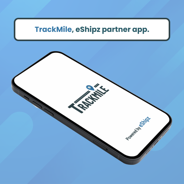
Trackmile is a subsidiary of a Bangalore based logistic company called eShipz. The Trackmile mobile app is used by the delivery personal to update the shipping status of a Shipment. Once a delivery personal delivers a package, he will take a picture of the Proof Of Delivery (POD) and upload it to the app. And once he uploads the POD picture, he will also update the delivery status of the shipment in the app. Which will reflect in the client’s dash board at the warehouse.

eShipz - Carrier Dashboard

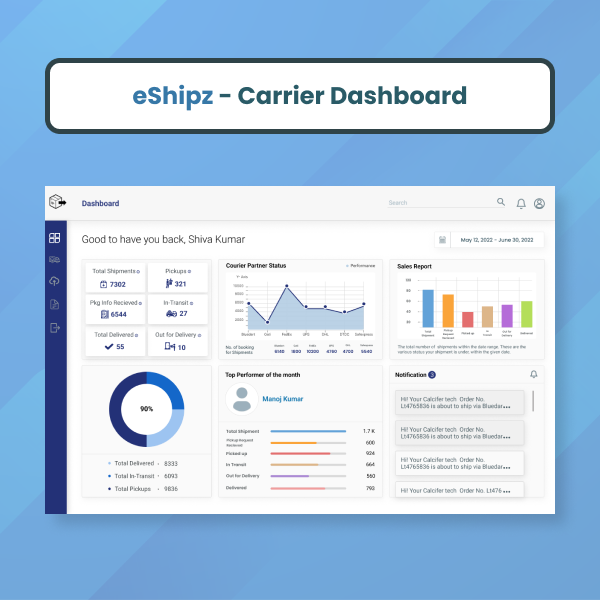
This is an app built to help manage the order deliveries and shipment details for carriers who cannot afford to have their own dashboard in their own website. The carriers also get an analytical report of their best performing client and zones where there is a higher volume of shipments taking place.

About Me

Product designer with nearly 5 years of professional experience, creating elegant, engaging & functional interfaces. I simplify communication barriers, bridging the gap between end-users, Designers, and Developers. Currently, I handle design as a User Experience Designer at eShipz.

Phone

+91 7348810821
+91 7305242485